Optimizing the Check Out Experience for Consumer Cellular
CLIENT
Consumer Cellular
ROLE
UX Designer
TIMELINE
Nov 2019 - April 2020
TOOLS
Sketch, InVision, Inspectlet, Google Analytics
SKILLS
UX Design, Interaction Design, Prototyping, User Research
Overview
Consumer Cellular is a mobile network operator that offers cellphones, accessories and cellphone plans to customers, with a target demographic of those that are 50+. Consumer Cellular sells their products and services to customers through their online website, call centers, and in select retail stores like Target.
Objectives
Optimize the check out experience
Identify user pain points and opportunities for improvement
Problem
Our client came to us asking for suggestions to optimize the shopping experience on their e-commerce website. As a mobile phone provider with no dedicated brick and mortar locations, Consumer Cellular’s website is an important sales channel. My team used quantitative and qualitative research to identify the step in the sales funnel to focus on and came up with opportunities to improve existing pain points.
Understanding the User
Consumer Cellular offers customizable no-contract cellphone plans aimed at the senior demographic and those that want to save money.
Define & Research
This research sought to explore the question “do users have difficulties going through checkout on the Consumer Cellular website and why?”. The checkout page was selected for analysis because it is the stage in the customer journey where a user has the greatest intent to purchase.
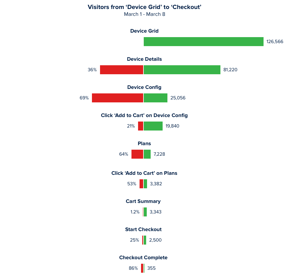
Data from our quantitative product funnel analysis indicated a high drop off on the checkout page and we wanted to use qualitative analysis to understand why.


Methodology
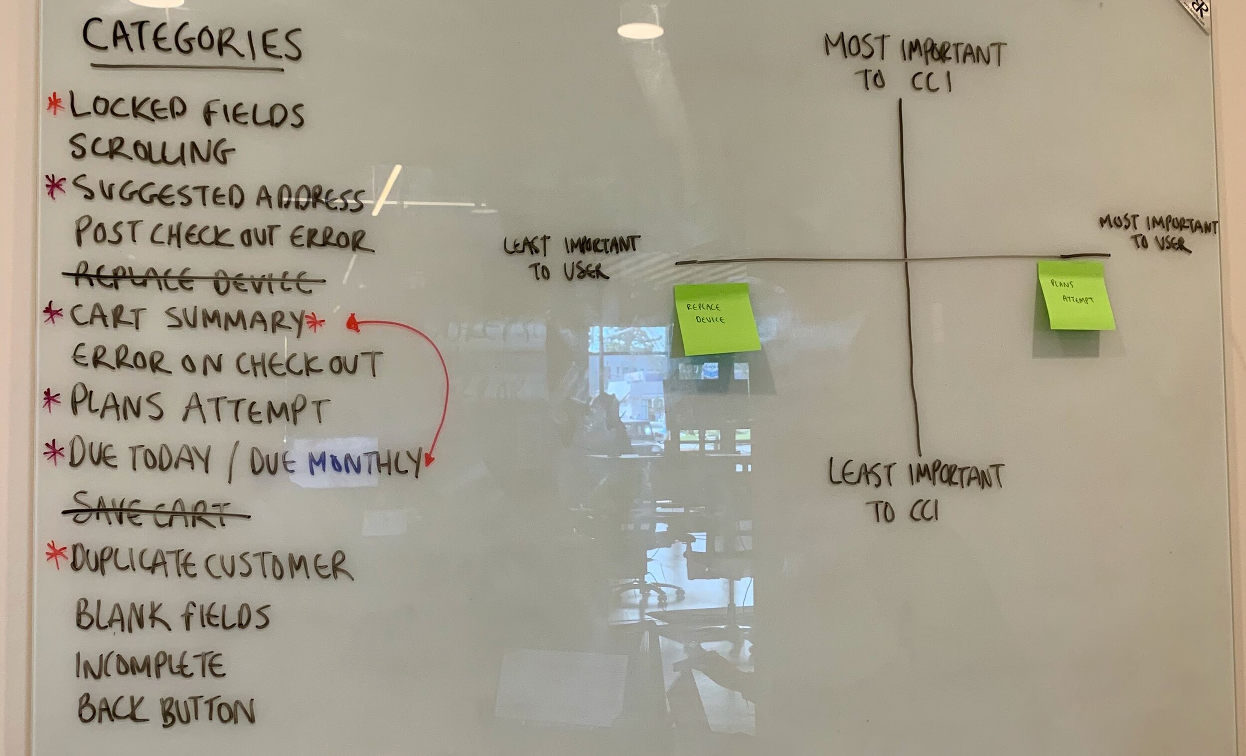
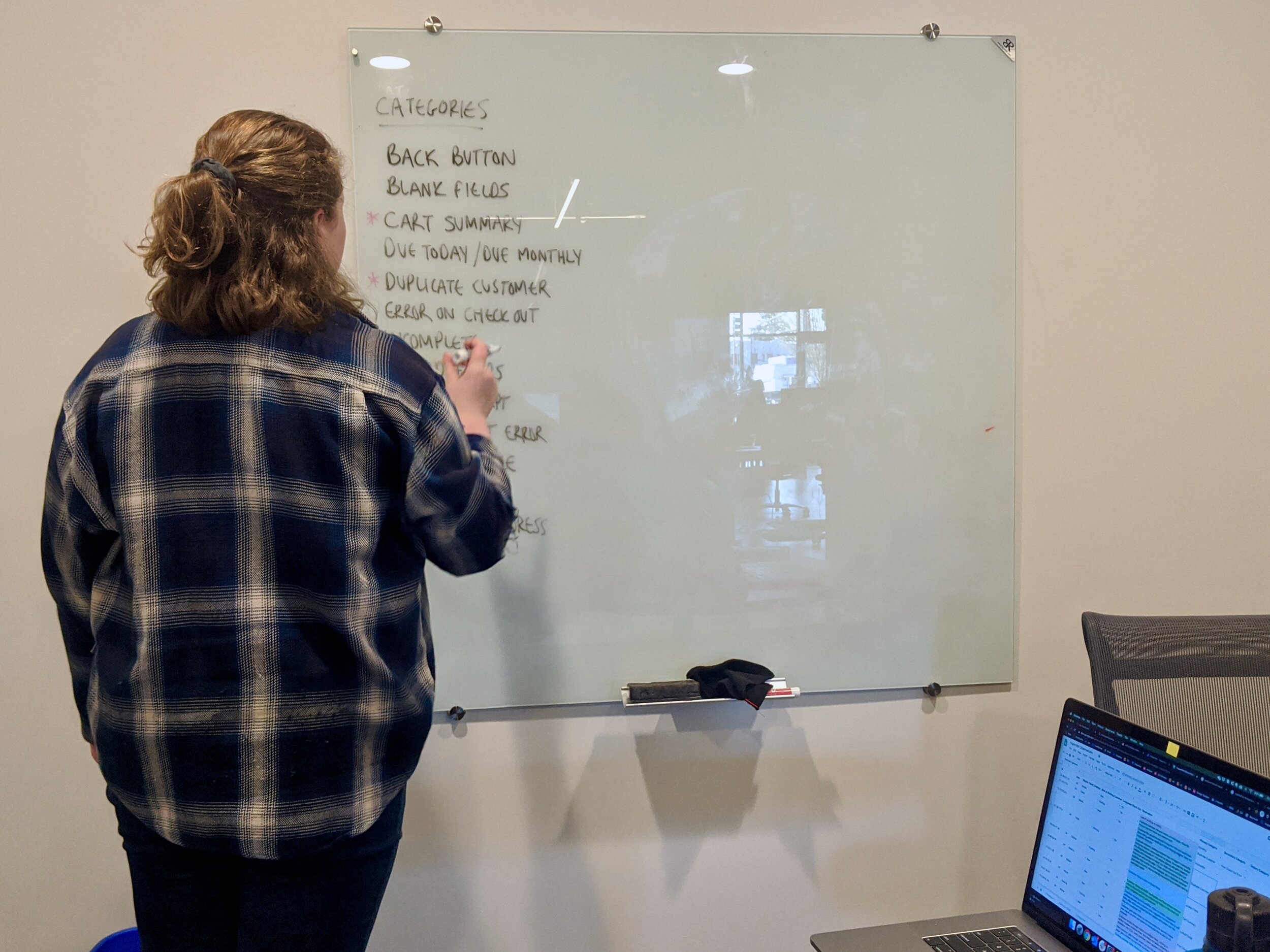
I observed 100 session recordings of new and existing customers, making notes of observations in a spreadsheet after watching each session. I then went back and used affinity mapping to group observations into categories/themes. Of the sessions that were observed, 65 were of new customers and 35 were of existing customers. 52 were on desktop, 10 on tablet, and 38 on mobile. To determine which categories to focus on first, I stack ranked the pain points based off of their ability to create roadblocks for a user who is trying to successfully complete a checkout.


Of the 14 categories/themes that emerged, I worked with my team to identify the 3 that caused the greatest hurdles for users. I worked to identify what the pain point was and presented those to the client with a number of opportunities that we could explore to improve each pain point.
Key Insights
Pain Point 1
Customers are navigating back to the cart summary page to see what they are checking out with.
New and existing customers are navigating back-and-forth between steps in the funnel on cart summary and checkout. If they get to the checkout page and begin entering information and then navigate back to cart summary, some of the input fields are erased. Customers navigating between checkout and cart summary are not clicking to expand the Phones & Devices and Monthly Service accordions on the checkout page, which contains their order detail summary.
Opportunities
Open the Phones & Devices and Monthly Service accordions on the checkout page by default
Provide an order summary with all costs including subtotal, shipping costs, taxes and fees on the checkout page
Provide an order summary with as many costs as we are able to calculate on the cart summary page. Include an input field where users can enter their zip code and calculate their estimated taxes


Pain Point 2
New customers don’t see error messages on the checkout pages before clicking the check out button.
Users are missing error messages that appear on both input fields and questions. There is a lot of information to scroll through and if a user has multiple error messages appear, they often only catch one error before attempting to click the checkout button.
Opportunities
Break the checkout page down into a stepped approach so users have fewer possible error messages to find and fix on one page
Improve the styling and/or placement of error messages
Create a new disabled button style so users have a visual clue that information on the page still needs to be completed


Pain Point 3
Existing customers are being asked to log in after attempting to 'check out'.
Currently, users are given the opportunity to log in on the Device Config page via the question "Already a Consumer Cellular customer?". If they select "No" they continue through the shopping experience as a new customer. Once this customer gets through the checkout page, they are presented with a post checkout error page that says they are a duplicate customer. They are then prompted to log in to My Account. If a user encounters other post checkout pages (i.e. EasyPay agreement), they see these other pages before they see the duplicate customer error page.
Opportunities
Provide an existing customer login experience on or just before the checkout page, before a customer begins entering any information
Improve the current login experience that exists in the navigation
Use customer input fields to determine if an existing account is found and prompt them to log in on checkout page
Reduce unnecessary steps by front-loading the duplicate customer error post checkout
Outcomes
The client was impressed with the research deliverable and requested future insights on a regular basis. They were convinced of the value that qualitative and quantitative research can bring, which set the foundation for future investments in our user experience expertise. At the time of this research, there was not available bandwidth to collaborate with the client on the opportunities we identified, but interest was expressed for future collaboration and eventual implementation of improvements.
Internally, a benchmark was established for product funnel analysis. In the future, this will provide us with data that can be used to validate design decisions.
What I Learned
How to collaborate with a cross functional development team
How to present research findings to a client
Product funnel implementation and analysis
How to advocate for qualitative and quantitative research internally and with the client
Future Iterations
Direct access to users
Implementation of improvements
Data to validate design decisions
A/B testing