Redesigning the WW Pricing Page
TL;DR
Redesigned the Pricing page in the web check out flow to reduce cognitive load and friction in the sign up process, increasing membership conversion by +23% (projected +10%).
Context
WW / WeightWatchers offers a scientifically proven program for weight loss and wellness, with Digital, in-person and Virtual Workshops, and Personal Coaching solutions to help meet your goals. For more than 55 years, WW has helped millions lose weight with the latest nutritional and behavior change science.
Goals
Increase prospects that convert from Pricing page
Improve decision making process of selecting a membership and plan length
Problem
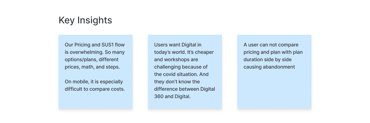
Product came to design with a business problem; users are dropping off of the Plans page, decreasing conversion. At the time, roughly 87% of users were dropping off of the Plans page before making it to SUS1 (sign up step 1). The hypothesis was that users don’t want to navigate between Plans and SUS1 to learn about our plans.
Who visits the Plans page?
Our users, or prospects as we refer to them within Growth, are comprised of new and lapsed, new meaning they have never used WW before and lapsed meaning they have used WW at least once in the past. WW is unique in that the majority of our prospects are lapsed users (70%) and on average, they have signed up for our program 3-4 times.
Process
The design team ran a design thinking workshop with stakeholders to start defining user problems and explore possible solutions. We prioritized the challenge statement:
HMW make it super easy for prospects to commit to WW (without understanding all of the intricacies of our programs up front)?


Reducing decision making
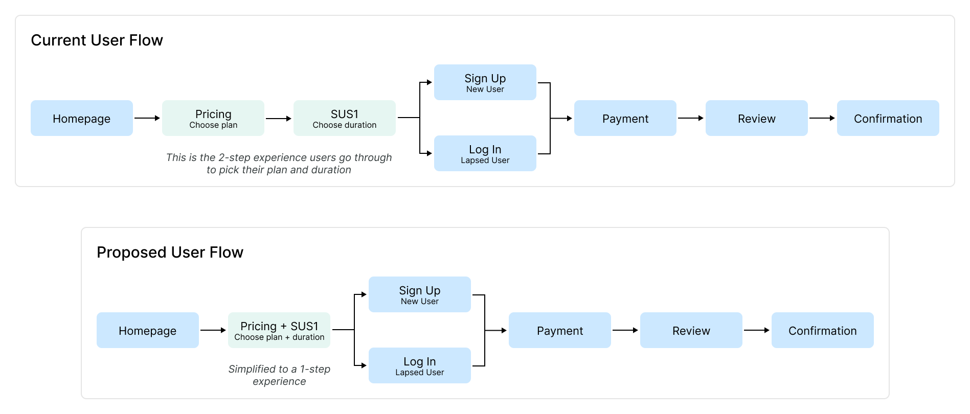
The “big idea” was to simplify the experience to help prospects compare and quickly learn about our plans so they can make a selection and proceed to check out. So, we decided to combine the Plans page and SUS1. This meant that the newly combined Plans page would show both membership and plan-length selection.
The long-term product strategy was to push “Digital” as the base membership, and have the other membership options (workshops, coaching) as “add-ons” or upsells.
This was in line with the teams hypothesis, that decreasing the number of decisions a user needs to make (in this case, selecting a membership type) would improve cognitive overload and ultimately increase conversion.
So, the team moved forward with “Digital” as the default selection on the Plans page, with an opportunity to purchase “add-ons” via a modal once a user enters the check out funnel.

Scope & Constraints
While reviewing with the team, it was determined that the engineering LOE would be higher to include the “add-ons”. Ultimately product leadership thought it was worth testing without the “add-ons” to see if the simplified flow would increase conversion so we moved forward with “Digital” as the default on the Plans page.
Additionally we weren’t able to change any of the price breakdown information that’s being displayed, so we added it to our backlog to revisit in future iterations.
Digital-forward test
In November 2021, we launched the Digital-forward test. We hypothesized that asking prospects to commit to WW (rather than an exact plan) would reduce sign-up friction and therefore increase conversion. The projected conversion lift was 10% and the winning US variant saw +23% lift in conversion.
This validated the teams hypothesis, that decreasing the number of decisions a user needs to make (in this case, pre-selecting a membership type) would increase conversion.
What we learned
Prospects are most likely to sign up for a plan that has been selected for them
Removing SUS1 improved conversion
Defaulting the membership to Digital drove conversion but shifted the product mix away from other memberships
Phase 2: Time to do the math
User Research and the 4 P’s
Our UXR team started research around the same time that we began initial explorations, which meant actionable findings were available following the first Digital-forward A/B test. We leveraged those findings to continue to identify opportunities to improve clarity and simplicity.
The research explored the 4 fundamental factors that sway a prospect’s buying decision and sought to answer the key questions:
How effectively does our guest site answer the 4 P’s (product, proof, price, POV) that influence a prospect’s buying decision?
What similarities and differences, if any, exist in the information new and lapsed members looked for on our guest site?
What friction points do prospects experience on the guest site? Whats causing these friction points?

We heard from research participants that the price breakdowns and offer terms could be clearer. We also learned that of the 4 P’s, the most important questions for both new and lapsed members were “How much do your plans cost?” and “What deals or discounts do you have right now?” Using these new findings from user research, we explored the challenge statement:
HMW simplify price breakdown to improve clarity?
We explored a number of iterations that aimed to simplify how we show price breakdown but continued to run into the same challenges: some elements on the pricing page are owned by different teams, limiting what we were able to change, and we have multiple offer types, which made creating designs that would be scalable pretty difficult.
As a product team, we were in the midst of fine tuning our processes related to A/B testing. In the meantime, to keep momentum going, the design team continued to build on learnings and identify future opportunities using the Lightning Decision Jam framework. This helped us take a step back and quickly define problems, identify solutions and map those on an impact/effort matrix to bring to product.

Next Steps
Continue to explore opportunities to simplify price breakdown, partnering with UXR to identify unanswered questions and discuss methods that would support us in our quest for more information
Work with product to identify short and long term opportunities for testing that are in line with product strategy and business goals